Showing posts with label left field. Show all posts

Wednesday, September 30, 2020

GEM SPA x Left Field NYC


I whipped up this drawing of an egg cream soda (and drank a few still life references) for a t-shirt collaboration between the iconic East Village spot GEM SPA and menswear brand LEFT FIELD. Originally the plan was to use the sales of the shirt to help Gem Spa keep their lights on and get through the pandemic until they could reopen but, unfortunately with no business coming in and still having to pay East Village rent, they had to close the store for good. 

It was then decided that Left Field would take their share of the proceeds from the t-shirt sales and donate it to LESPI - a non-profit that seeks to preserve the historic streetscapes and buildings of Manhattan's East Village, Lower East Side, Chinatown, Little Italy and the Bowery. 

This is a very small run of shirts so if you wanna get one, you best git to it ASAP! All shirts are made and in printed in the USA. Click either of the links and let the purchasing begin - LEFT FIELD NYC -  GEM SPA


Saturday, December 14, 2019

Left Field Coal Candy


Recently illustrated a couple labels for some holiday treats from Queens-based menswear brand, Left Field. One bag is full of milk chocolate candy rocks and the other is full of something not quite as tasty, or edible for that matter. I always loved checking out candy wrappers when I was younger for all the crazy designs and colors so this was an especially cool little gig for me. Big thanks again to Christian McCann at Left Field. These are available in-store or online at LEFT FIELD


Thursday, June 6, 2019

Left Field NYC Denim Flasher


Had the opportunity to work with Christian McCann again at LEFT FIELD NYC on another project recently. This time we put together a denim flasher for his new line of men's workwear based off the heavy duty workwear that coal miner's wore. At first we shot for a sort of homage to the classic advertising illustration for menswear in the 50's/60's but then moved into a more serious tone for the illustration. Had a blast looking through all the old illustrations from the golden age of advertising illustration and creating my own version of that. The line is now available with my flasher attached. Check it out HERE


Wednesday, January 2, 2019

Left Field x Prime Denim Label


A few months ago I had the opportunity to work with Left Field NYC again on a denim label for a collaborative jean with Prime. The image definitely went through some changes, as you'll see in the sketches below, until we finally settled on "the one". Originally, there was going to be a large sacred rock in Australia in the background but that got nixed and then we went for a few different versions with a wave crash and then a shark until we got the composition that included both.


The final product came out with black ink on a tan patch but I had the classic Levi's label in my head when I did this color study in red. It was still helpful though in figuring out the contrast for the final illustration. It was also tricky working on something that was going to be shrunken down to the size of a business card because I am such a detail oriented person but I think I was able to pull the reigns where it was needed. Probably could have a little more but, whadda ya gunna do?


The jeans are available on Prime's site and they are a pretty penny but knowing the quality of Left Field's denim I would bet these puppies are totally worth it. The craft and attention to detail in their products is really amazing and I'm stoked to work with such a reputable brand. Thanks again to Christian McCann for the opportunity to work on something I never considered taking a shot at illustrating and, in the end, being really happy I did it.

Sunday, July 8, 2018

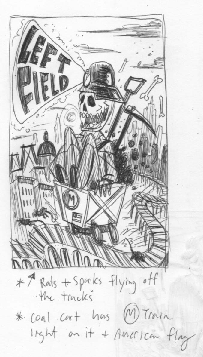
Left Field


New illustration for the 20 year anniversary of Queens-based menswear company Left Field. There's a big influence from the coal mining gear and tough workwear worn in the 20th century so I tried to make this look a little gritty by putting some charcoal down and just smudging it all over the coal miner. I feel like my work used to look way dirtier years ago and at first I was a little bummed that it's been looking cleaner but I think I've just learned to restrain myself and try to use certain materials on a piece when it calls for it. Anyways, it was fun to rub some charcoal all over this one. It was also brutally hot the whole week I worked on this and I feel like that really crept into the look of this poster. Every time I look at this illustration now I just feel the oppressive heat of summer days in the city. Be sure to swing by the next time you're in Ridgewood and check out their rad looking store on Woodward Avenue and grab some goods. Thanks to owner, Christian McCann for hitting me up for this project.