After digging through most, if not all, of the work I've done the past 10 years I think I can say that these 10 pieces are my favorite. Reasons vary as to why I chose these ones but all of them had an important role in helping me feel like I was doing something right, personally and professionally. I'm sure I could break these down on a scale from 1-10 in terms of importance but I'll just leave them here as the top 10, in no particular order.

This was a big shift for me. I had been very line oriented and was only using watercolors but the look and colors I wanted to create the neon cat pieces with required me to change my materials a little. I had developed a very big interest in neon signs and studying the characters in NYC. I also had a few years of living here under my belt and was well aware of bodega cats. I started to think about them as drawings, inhabiting the human characters that I saw around corner stores/bodegas/deli's and using the language on the awnings to create a humorous piece. I started using fluid acrylics for these pieces because I found they could be thinned out enough to let the white of the paper come through but could also be built up to create some deep darks. I did a series of 5 bodega cats but didn't feel like completely giving up drawing for painting and knew they looked a little out of place from my usual work. Since then I've tried to combine this way of working into how I had created pieces previously and it has definitely helped reinvigorate me when I felt like my work was getting bland.

I did not want to make this piece at first. I was feeling burnt out at the time but my friend who wanted me to make it with him was so much fun to collaborate with and just a ball of insanely positive energy. We came up with this just rapping in the basement at our job and the second we said "Escape From Choking in New York" it was on. A couple months after I finished it, it ended up being featured on Bloomberg Businessweek, Juxtapoz, NPR Studio 360, Kotaku, among other sites. People loved it, talked shit about it, and asked for prints of it for their restaurants, bars, coffee shops. It was the first piece of mine that really reached an audience of that size. And it's crazy to think I almost didn't do it. Thanks Trey!

Bruce Springsteen fan art. I really dove in and devoured a lot of the music of The Boss around 2011-2012. He became a big interest of mine around this time, and remains one of my favorites to this day.

This was done for a show celebrating the film work of Roger Corman and Joe Dante at Hero Complex Gallery in LA. I still love how I drew the Frankenstein fans and Sylvester Stallone's expression. I had a lot of fun working on this composition. For a piece I loved making so much, it was kind of funny that it was also when I started losing interest in doing "fan art" and working on my own ideas rather than celebrating someone else's work.

This piece was pretty fun and it was great to do something for a neighborhood institution like Roberta's, where probably everyone I know spent some time eating and drinking at before cool celebrities and The Clintons started showing up. And that's why I really chose this piece: The Clinton connection. This was the piece that got lumped in with a lot of work that the Pizzagate conspiracy theorists were using as ammo to push their theory that certain pizzerias basements around the U.S. were hiding a diabolical secret that high powered liberals, like Hillary Clinton, were operating a secret satanic cult complete with sacrifices, pedophilia, and plans for world domination. This all resulted in death threats being called in, labeling people "satanic artists" and someone actually shooting a rifle off in the D.C. based pizzeria Comet Ping Pong, where they claimed the cult was based out of, demanding to know where the children were being held prisoner. It pissed me off and equally made me nervous that my work was being used in this agenda but at the same time I couldn't help but laugh at the absurdity of it all. Somewhere out there, people saw the Clintons eating at this particular pizzeria as further proof that there was something truly evil happening in restaurants around the U.S. As someone who worked with Roberta's and understood their aesthetic, I can tell you, it was just this moment where an incredibly popular pizzeria, in an increasingly popular section of Brooklyn, that liked using trendy satanic imagery, served food to a famous political family a lot of people would love to see destroyed. Man, maybe it all is a little too perfect..
All of this sent me on a crusade to learn more about conspiracy theories and the people who believed in them and after talking about it with a friend, introduced me to the work of journalist Jon Ronson. This is all why I chose this piece; It was fun to do, I liked the business it was made for, and got me to a great writer/thinker

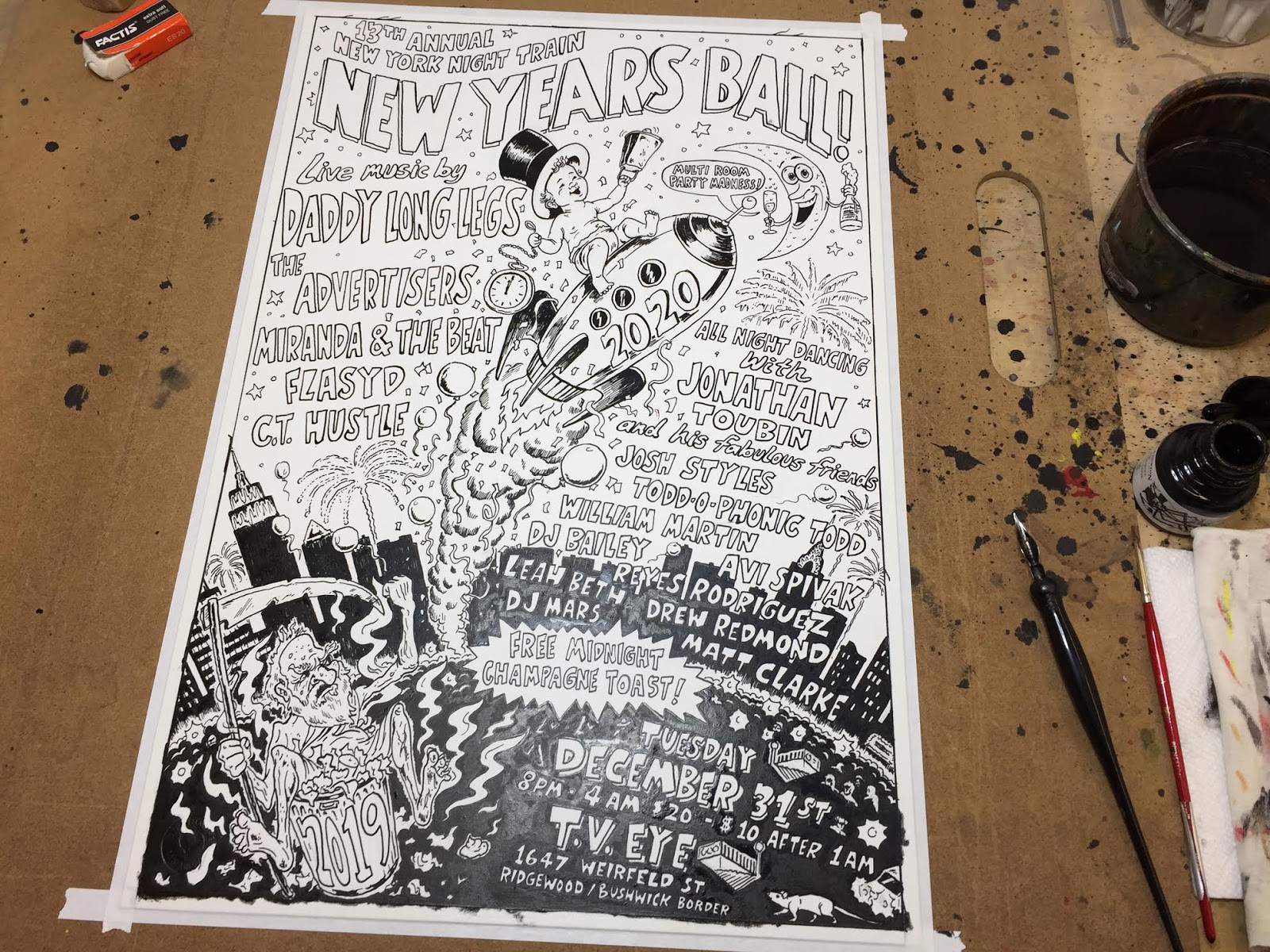
This was a breakthrough piece for me with my Soul Clap & Dance-Off posters. I was still trying to find an effective way to mix my style with Jonathan Toubin's aesthetic and I think this was the one where I got it. I'm really happy it was the poster where we used James Brown as well. This was also the first piece of mine that received recognition from American Illustration.

I just can't believe I was lucky enough to catch this moment. It's like this cat knew when he wandered over he was going to make this sketch of a beat up motorcycle infinitely better.

I made an a-frame drawing of this clock, before this version, for Gimme! Coffee back in 2017 and people really reacted to it in a very positive way. It helped me realize my sarcastic sense of humor in some of my pieces was connecting with other people and it was a big encouragement to be less reserved when unleashing this sort of work.

This past year I've been really interested in the weirdos of small towns. Not the whole, 'isn't it strange people don't leave their hometowns' or the culturally sheltered aspect of it, but more the work that's being made by the weirdos that exist in them. There's something way more interesting to me when people let their freak flag fly in a small town, rather than a major city, because everyone tends to be involved in everyone else's business. This graffiti really existed when I was about 12-13 years old and I love how it absurdly disrupted people as they walked or biked past it.

I think this piece is one of my more successful attempts at communicating my frustrations with contemporary life. Sorry for the glare. I still need to scan this one in so this photo will have to suffice for now.